

L. Lu Fine Jewelry
Homepage Design
The Project
Design a responsive homepage for L. Lu, a fine jewelry reseller, that will be hosted on WordPress.
Phase
August 2022
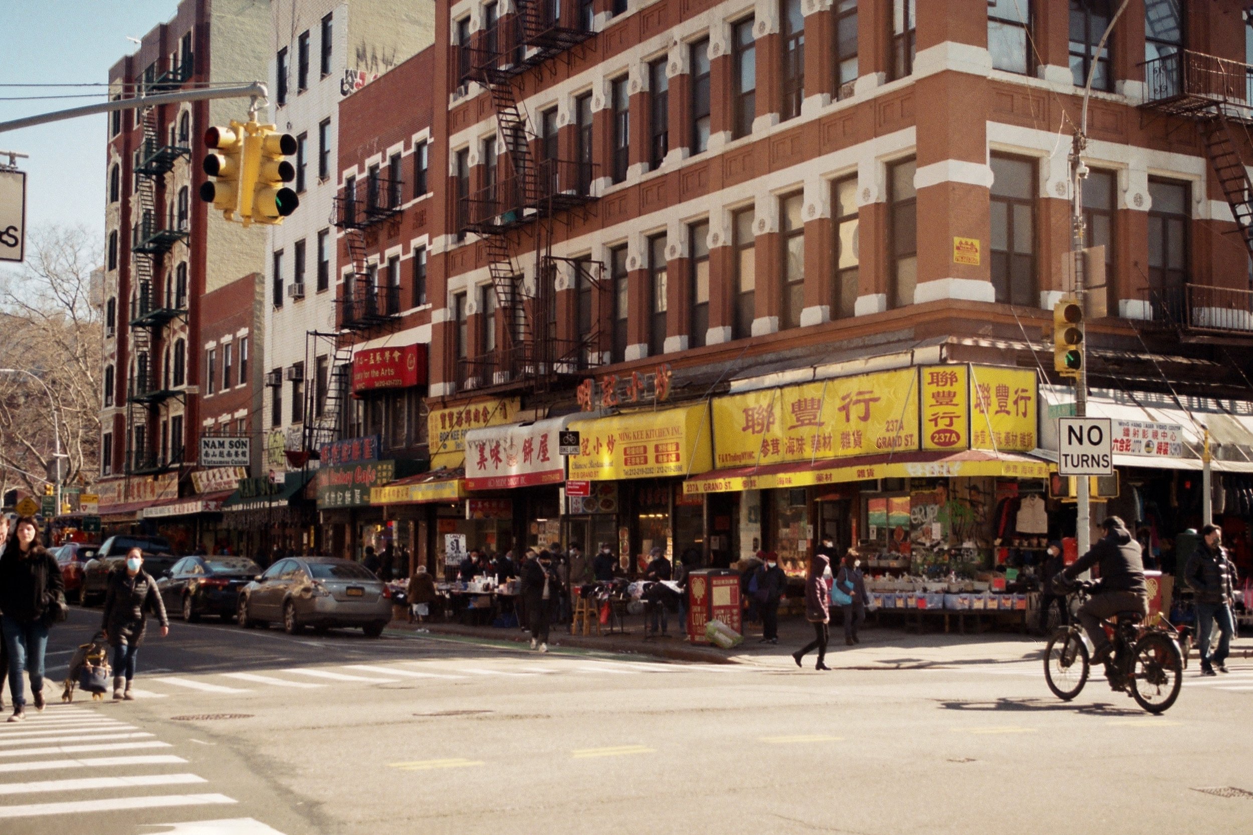
About L. Lu Fine Jewelry
L. Lu Fine Jewelry is a reseller that connects buyers with family-owned small businesses from Manhattan and Queens’ Chinatowns. Their aim is to make “shopping small” simple for users by providing a space to shop from a curated selection from our partners with vast inventories and generations of expertise in custom jewelry.
The brand recently went viral on Instagram and needed to update their homepage to inspire user confidence, better represent the brand, and improve conversion.
Where we started…
The client came to us with the DIY website she put together using WordPress and WooCommerce. It was a basic site that served the business well enough in the past, but after going viral on Instagram, they realized conversion from those clicks was low. We sat down with the client to determine her goals, constraints, and direction for the homepage redesign.
The Team
The project was completed in collaboration with Bennett Capozzi, the engineer.
The Contraints
This client came to us with a micro-budget for the redesign hoping to refresh the homepage of her website, which is hosted on Wordpress.

Client’s Goals
Mission: connect modern shopper with small business jewelers in Chinatown
Improve “organic demand” to help boost approachability and keep people on the site. Getting people to shop on the site is the priority.
Keep as much of the original copy as possible. She's really proud of the work she did there, so be mindful of that.
Be more object/ product focused
Push top sellers: Jade and Gold collections
Keep the red, use it more
Improve SEO
Brand Keywords
Authentic
Milennial
Casual Luxury
Casual Luxury
Approachable
Familiar
Dainty
Approachable
Designing the Homepage
Evaluation of Existing Homepage,
Recommendations for Improvement,
and Designing the Homepage Wireframe.
Due to the client’s limited budget, my collaborator and I decided to abridge the design process. As there was no budget for user research, we presented the client with our ideas for how the current information on the page could be improved based on her priorities, some potential directions based on common best practices, and moved forward with the client’s requests.
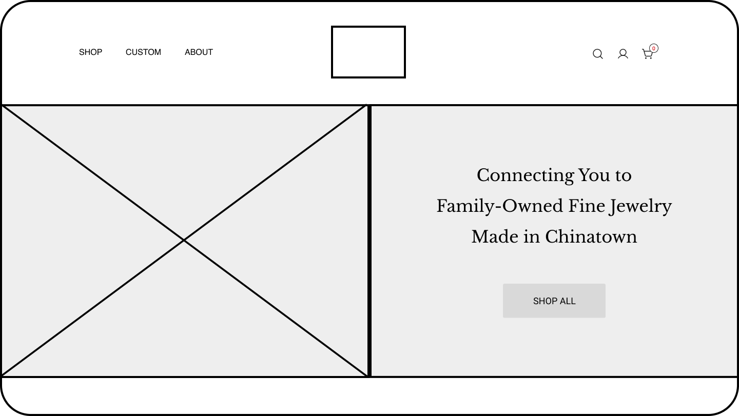
Hero Section
Re-configured the logo, so that it is a less awkward shape and takes up less real estate in the navigation.
Simplified and reduced the amount high-level navigation items
Switched hero section to a split screen with hero image on one side, company tagline, and CTA button on the other.

Best Sellers Section
Added a “Best Sellers” section in order to present the product better and introduce more shopping opportunities from the homepage for the user.
The aim with this section is to help improve both conversion on the site and SEO.

About Section
Consolidated the separate About sections in one. I was conscientious of the client’s request to keep much of the original copy.
Included buttons here to direct users to the non-shopping pages that inform them about further about the company mission and brand.

Donation and Footer Sections
As the company is mission-driven, it was important to keep a charitable component on the homepage.
Bookended the homepage by mirroring the split-screen design of the hero section.
Redesigned the footer to provide more utility and information for the user.
Brand UI Elements
As the client already had a pretty solidified brand established on the company's Instagram, she was focused on polishing the elements on the site to reflect that brand. She also wanted a limited color palette, emphasizing red.


