MIRROR.
Established in 1994, MIRROR has 400 stores in 32 countries worldwide. They wanted to launch their first online store along with a branding refresh.
**This is a case study for a fictional product. It is a design challenge developed by Designlab.
Design Challenge
Design brand elements and a responsive e-commerce website for an apparel company.
Timeline
December 2021 - January 2022
Role
Product Designer
Table of Contents.
I. Empathize.
Client Brief
Market Research
User Research
II. Define.
Project Goals
Task Flows
Product Requirements
III. Ideate.
Wireframes
Brand Elements
IV. Prototype.
Responsive UI Screens
Test Planning
V. Test.
Usability Testing
Affinity Map
Priority Fixes
I. Empathize:
What was I aiming to understand?
I wanted to know what potential customers appreciate about online shopping so that I can adapt and implement those features to suit MIRROR’s large inventory.
In order to better understand the business, the market, and the user, I prepared a
Research Plan.
What were my Research Objectives?
Establish the company’s current state and immediate goals for the launch of its website.
Develop a Persona: a fictional end-user whose characteristics are based on research and who will help shape thought processes around design.
Determine what common browsing and searching functions (categories, filters, etc.) online shoppers find most useful.
Discover the common obstacles users face when shopping online.
What Research Methodologies did I use?
Comparative and competitive research to see what other large retailers who have moved online offer and how it’s presented.
User Surveys with participants who are familiar with online shopping.
Competitor Research
Stores that cater to middle-class consumers tend to have large inventories and complex navigation systems. They’re conscious to keep the top navigation simple with high-level categories only. Mindfulness on how those categories and sub-categories are sorted, organized, and displayed is important to businesses and users for both aesthetic and technical reasons.
According to Forbes, the best way to cater to the middle class is to create a satisfying experience. One way to do this is by presenting and selling a lifestyle to your ideal customer. With most major retailers having e-commerce sites, it’s important to establish brand differentiation, but still follow online shopping standards to which users have become accustomed.
-
For direct competitors, I researched online fashion retailers that are:
Good for budget shoppers
Both physical and online stores
Available around the world
Clothes for many types of people (men, women, kids)
Target market between 18 and 40-years-old
-
For direct competitors, I researched online fashion retailers that are:
Good deals available
Stores with long history and/or legacy
Large inventory, but also sell products that aren’t clothing
However, these are US-based stores
Direct Competitors:
Uniqlo and Zara
Indirect Competitors:
Nordstrom Rack and Macys
User Research
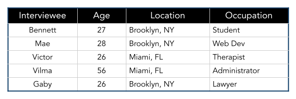
For this phase of research, I screened for users who are familiar with online shopping. I selected 5 individuals to interview, ranging from age 26 to 56. They reside in the metropolitan areas New York City and Miami.
User research participants
These were the Key Findings from my user research:
-
Simple navigation and straightforward presentations.
-
When it comes to filters and menu categories, users have an easier time when they follow the standards they’ve learned to expect.
-
Size guides, reviews, materials, and care instructions help users make purchases with confidence.
-
Pages on the site unrelated to browsing, item information, and checking out, as well as excessive pop-ups (particularly those triggered by hovering over areas of a page), contribute to a negative online shopping experience.
User Persona:
II. Define:
How should we solve the problem?
MIRROR needs a responsive e-commerce website that is modern, neutral, and thoughtfully designed to host their large inventory.
Layout the
Project Goals.
From the research findings, I established goals for both user and business while taking technical considerations (and their intersections) into account.
Product Roadmap:
What features do users need to ensure the product functions? What can I add to make the product more enjoyable? The priority features were validated by stakeholder research, market research, and user research findings. Whereas, bonus features were validated by one or two of the findings.
Priority Features:
Simple Top Nav: Shop All, Women, Men, Kids, Sale
Search Bar: Search bar
Browsing Filters: Ability to narrow PLPs by filters, such as size and color.
Sort Options: Price low to high, Price high to low, Rating, What's New
Size Guides: Measurement and model size references
Reviews: User-generated reviews
Help/ Contact Us: Offer customer service, FAQs about store policies, report site bugs/ pain points
Main sales event banner: Contains hero image and shop sale CTA
Location Selection: Since Mirror is international, they'll need to have language and currency selection
Shopping Cart: Place to view and edit items to be purchased, view total payment, and checkout
Sign up/ login: Provide users a way to create an account for shipping info, quicker checkout, store credit/points, order tracking, etc
Bonus Features:
Featured Collections: Inventory "Edits" or collections with sales events, and eventually seasonal products, partnerships, occasions, etc.
Saved items: A way to save and keep of list of items for later.
Quick view from browsing: Button on image cards that open a product overview card with abridged item details and the ability to add to your cart from the PLP.
Customer review photos: Users can view how an item looks on other customers a further understanding of sizing/fit and quality
Setting up the
Primary Task Flow
The primary task flow I decided to focus on was purchasing an item on the site, from browsing to checkout. I also outlined a potential secondary flow for creating an account for first time users.
III. Ideate:
What should it look like and how should users interact with it?
Sketches and wireframes helped me determine how users will interact with the site to carry out tasks. Brand elements, which helped establish the look and lifestyle being presented to users, were are also developed during this phase.
From paper sketches to responsive wireframes.
From my many paper sketches, I created digital wireframes for all the screens required to test the main flow. From them, I tested that users would be able to complete the primary task flow with a low-fidelity prototype. I also created responsive wireframes for the homepage to ensure the product would be useable across devices.
Designing and Deciding Brand Elements
-

Logo Design Process
Due to the highly saturated and competitive market, a text logo is the industry standard for brands like Mirror in order to establish name recognition.
The logo would be an opportunity to create a trend-aware, modern element with character.
However, I did not want it to distract from the overall design.
I was conscious of how the logo would look in other brand settings, like the shipping materials/ packaging.
-

Color Palette Decision Process
Black and White/ greyscale color palettes were a popular UX trend at the time of design.
It is a classic and timeless palette in fashion while being chic and modern, which was aligned with Mirror’s rebranding goals.
These color options would allow products and other brand elements to pop.
Additional Elements…
-
Buttons and States

-
Typography

Product Card Anatomy
UI Screens for Desktop
Homepage

Product Listing Page

Product Display Page

Shopping Bag Page

Responsive Design for Mobile
Although most users stated that they prefer to shop at home on their laptops during the research interviews, some also sometimes browsed from their phones on the go. Creating a responsive design of the product ensures that users will be able to use it regardless of the device available.
IV. Prototype:
How can we show and test the Primary Task Flow?
To test the primary task flow(s), I created a high fidelity prototype from my wireframes and a plan for usability testing.
Prototype
I built the prototype to test that users could browse Mirror’s shopping functions: browsing, filtering, adding to cart, etc.
Usability Testing questions to keep in mind while designing the UI Screens and Prototype
-
Is the site easy to navigate? Are actions easy to identify and follow? Are instructions clear?
-
Do users have a preference in their browsing method: main menu or search bar?
-
Can users complete the main flow? Is it easy for them to move back and forth through the flow?
-
Do any roadblocks occur and, if so, are error messages are clear enough that the user can easily self-correct without further assistance?
V. Test:
How can the product be improved?
Usability testing takes the product design to users, determines design pain points and wins, and establishes what the priority fixes should be.
Usability Testing Overview
Test Subject
Mirror shopping screens prototype for desktop.
Test Methodology
In-person testing.
Participants
4 participants, ages 24-56, with varying degrees of comfort shopping online.
Goals
Users should be able to:
Browse
Add Filters
View Reviews
Go to Shopping Cart
Add to Cart
Remove from Cart
Results:
Usability Test Findings
-
87.5%
Completion Rate
Users were able to complete both flows with 87.5% completion rate
-
8:15 mins
Average Time
Users were able to complete both flows in an average of 8 minutes and 15 seconds
-
4.81 out of 5
Average Rating
On average, users rated the usability and enjoyability at 4.81 out of 5
Affinity Map
After conducting the usability tests, I watched the recordings of each participant and gathered data on pain points, wins, and areas of potential improvement. Sorting this data helped determine what the priority fixes should be. It also got me to start brainstorming some next steps for the product.
Priority Fixes Made:
✓
I alphabetized filter selections to make finding filter options easier to find (except colors, which remain in ROYGIV order).
✓
In the quick view overlay, I added a “see all” link beside the reviews which will take users to the PDP.
✓
I added an error message when users click the inactive “Add to Bag” button to cue that they needed to select a size or color.
✓
I tucked the PDP info below the “Add to Bag” button (About, Materials & Care, Shipping & Returns) into an accordion menu to reduce the amount of text on the page.
Proposed next steps to improve MIRROR.
Set up the Sign-in/ Sign-up, Account Details, Saved Items, and Order History pages.
Add a “Recently Viewed” products feature so users can easily return to items they were interested in while browsing.
Add a “Find a Store Near You” feature.


