

Dedicated Co.
Marketing Website
Design Challenge
Design brand elements and a responsive website for a software development consulting group.
Timeline
February 2022
About Dedicated Co.
Dedicated Co. is a software development consulting group. They’re focused on building and optimizing e-commerce sites for small businesses and startups.
Having worked on client projects for Dedicated Co. before, I was aware they needed their own website and brand elements. As they were familiar with my work already, I pitched the idea to them and presented a potential timeline of deliverables and some sample logos. They were on board, so we locked some check-in meetings into the timeline and I got to work.


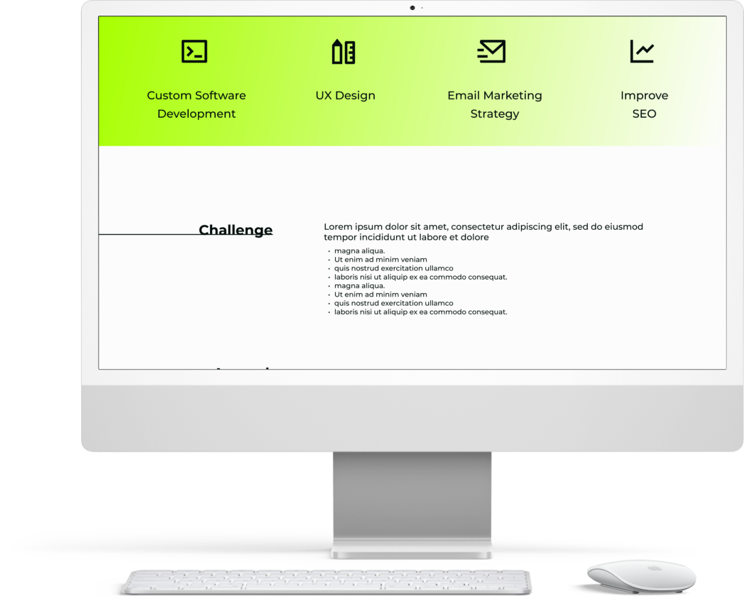


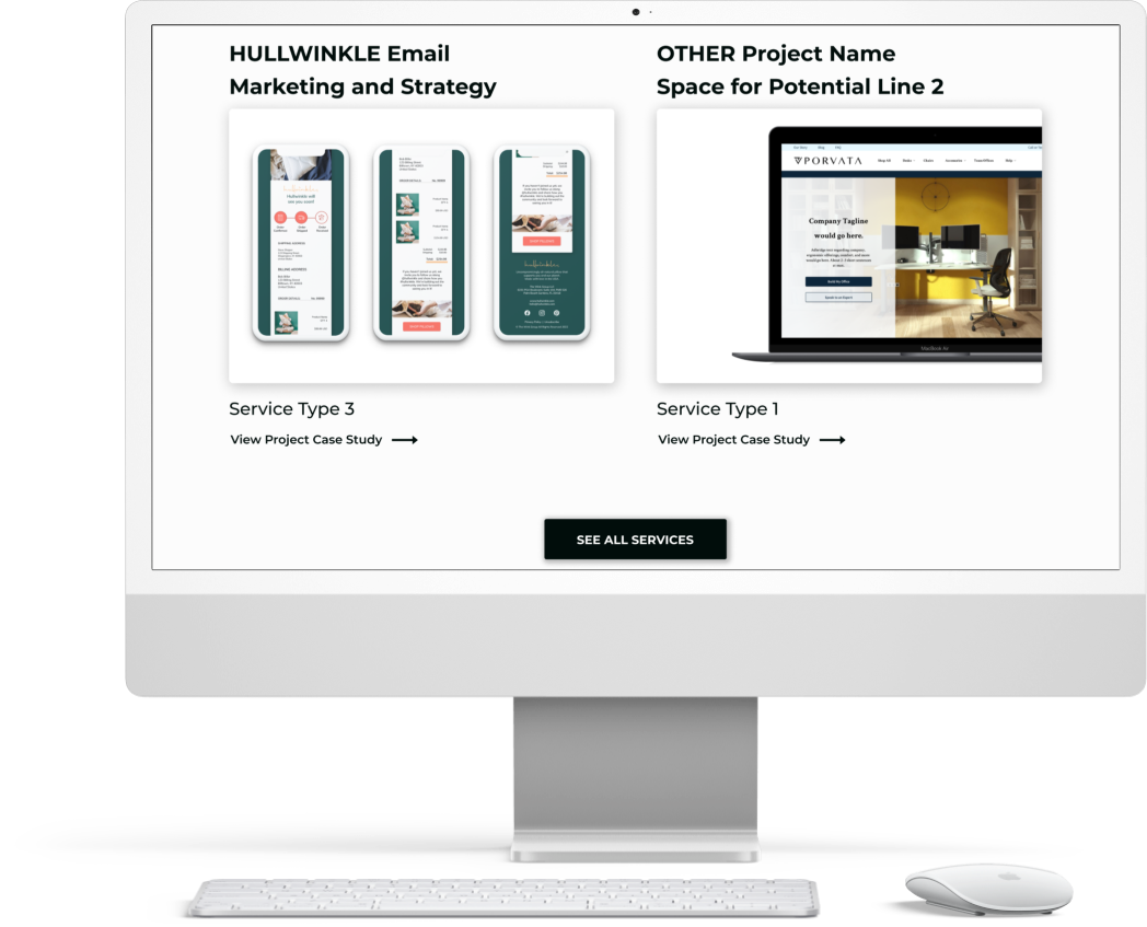


Table of Contents.
I. Empathize.
Client Brief
Research Objectives
Market Research
User Research
II. Define.
Project Goals
Sitemap
Task Flows
Product Roadmap
III. Ideate.
Wireframes
Brand Elements
UI Screens
IV. Prototype.
High Fidelity Prototype
Usability Test Planning
V. Test.
Usability Testing
Test Findings
Next Steps
I. Empathize:
What was I aiming to understand?
I wanted to know what are the deciding factors for users when choosing a service to build an eCommerce website, so that I can design a website that establishes a high level of trust and expertise.
In order to better understand the business, the market, and the user, I prepared a Research Plan.
What were my Research Objectives?
Establish the company’s current state and immediate goals for the launch of its website.
Determine how to best present information about the client’s past work and services offered.
Discover what are the factors driving individuals and companies to seek out help from consultants.
What Research Methodologies did I use?
Comparative and competitive research to better understand the field and what other consulting groups are usually presenting to clients on their websites. Also, to see what competitors are doing successfully (and not).
Research Interviews with participants who have set up websites for a business.
Competitor Research Findings
To catch users’ attention, websites should immediately establish the company’s expertise, style, and tone. The website should be quick and easy to navigate to demonstrate that expertise. That way, users can easily view services offered, past work samples, and get in touch. They should not have to look around for how to get in touch and all communication should be centralized (ex: there shouldn’t be different contact forms for quotes, explanation of services, etc.).
Including samples of past work on the homepage that highlights each service provided is a good way to cover both those elements in one place and further establish credibility.

-
For direct competitors, software consulting groups.
Tend to feel attainable only at a relatively high budget.
They have a distinct brand and tone.
Despite specializing in software, successful sites have a warm and “human” feel.
Testimonials from past clients help establish credibility.
-
For indirect competitors, I researched large freelance work marketplaces (like Upwork and Fiverr):
Less expensive services.
A very wide range of services and contractors are available, making it a bit overwhelming.
Past work is not immediately visible.
Users leave reviews/ rate work received.
Research Interviews Findings
I created two cohorts for my interviews: Individuals (product owners) and Project Managers (those who work for product owners). Because a primary goal of the site should be to establish trust with the user, I prioritized learning how past experiences could influence future contractor decisions.
User Insights
When users research services independently, they look out for ease, flexibility, learnability, plug-ins and integrations availability, and cost
Users look for outside help when their needs go beyond available templates and they need more custom work.
When users go with word-of-mouth referrals from a trusted source, they very rarely do too much comparative research. They do, however, still ask to see previously completed work.
User Pain Points
Templates often leave users who tackle builds on their own unable to meet the vision they had for the site.
When users hired consultants, they found the connection between intended designs and development seemed to be lacking. This is usually due to design and development coming from different sources, communication between the two being spotty, and a perceived lack of attention or clarity with the design guides and client desires.
II. Define:
How should we solve the problem?
Dedicated Co. needs a responsive website to establish their company brand and continue to draw in new clients.
Layout the Project Goals:
From my research, I compiled the goals for both user and business, as well as technical considerations into account into a Venn Diagram, while taking technical considerations (and their intersections) into account.
Product Roadmap:
What features do users need to ensure the product functions? What can I add to make the product more enjoyable? The priority features were validated by stakeholder research, market research, and user research findings. Whereas, bonus features were validated by one or two of the findings.
Priority Features:
Simple Top Nav: Home, Services, Portfolio, About, Contact Button.
Contact Page: Contact form to collect necessary potential client info.
Services Page: Outline of services provided, mostly text on this page.
Portfolio Page: Past work cards with thumbnail, company name, service provided.
Work Pages: Project headline, challenge, approach, project results, images of product throughout, link to live pages.
Testimonials: These should be testimonials from work samples hosted in the portfolio.
Footer: Nav links, social media, contact button, copyright.
Bonus Features:
About: Information about Dedicated and what sets it apart from other consultancy groups, including bios of founders.
Blog: User resources + further establish industry expertise.
Newsletter sign-up: For company announcements and promote blog posts. Sign-up would exist on the homepage in the footer.
Light and dark mode: Ability to switch between light palette and dark palette, at least on the blog once that's available.
Sitemap
I compiled the priority features into a sitemap outlining the website’s pages and clickable components on each. In addition to helping plan out the site navigation would work, it served as a visual aid in presenting the priority features to the clients and allowed me to move onto the ideate phase confident that we were all on the same page.
Setting up the
Primary Task Flow
The primary task flow I decided to focus on was reviewing the company’s
credentials and then getting in touch.

III. Ideate:
What should it look like and how should users interact with it?
Design pattern research, sketches, and wireframes helped me determine how users will interact with the site to carry out tasks. Brand elements, which helped establish the look and lifestyle being presented to users, were are also developed during this phase.
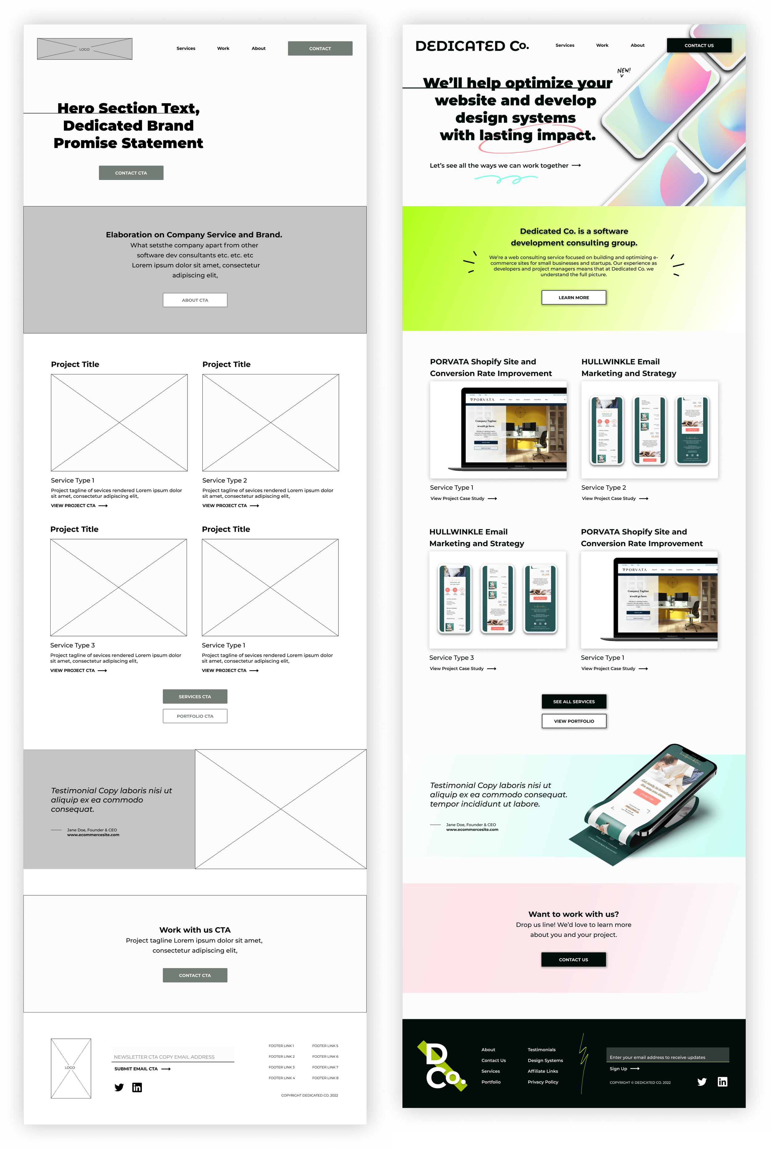
From paper sketches to responsive wireframes.
From my many paper sketches, I created digital wireframes for all the screens required to test the main flow. From them, I tested that I was able to complete the primary task flow with a low-fidelity prototype. I also created responsive wireframes for the homepage to ensure the product would be useable across devices.

Designing and Deciding on
Brand Elements
Logos and Symbols
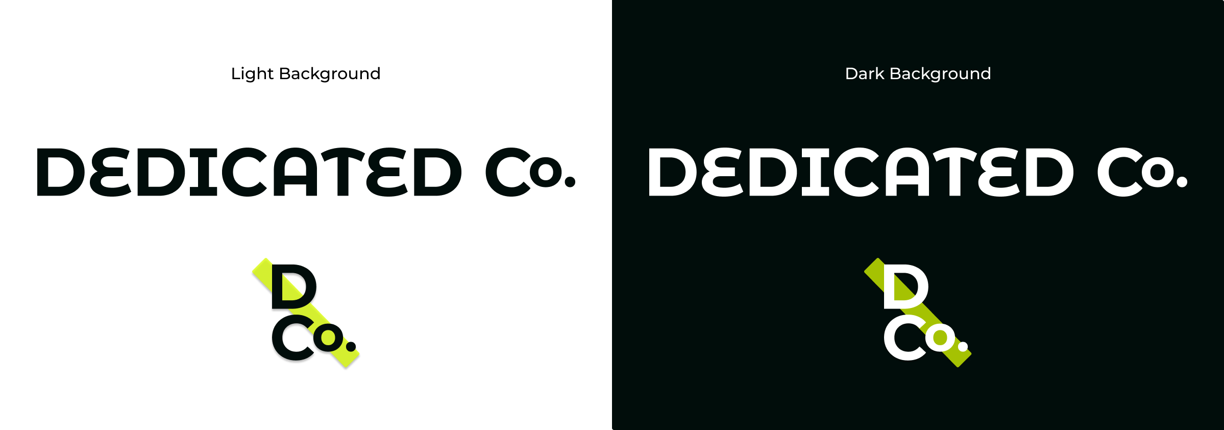
I decided to go with a simple text logo to help users easily identify the name of the company.
When deciding on fonts, I looked for sans serif options with rounder qualities to give a friendly and welcoming feel.
For the symbol, I thought about how it would look in other settings, like email signatures, and wanted to incorporate some of the color elements from the site.
Color Palette

Because Dedicated Co. provides is a highly technical and digital service, I wanted to make sure the color palette was bright and playful rather than sober and serious.
Additionally, a distinguishing factor of the services they offer is developing a project plan and providing clients with clear roadmaps on how to build on the work. For this reason, the color palette and other design flourishes allude to note-taking and annotations.
Additional Elements…
-
Buttons and States

-
Typography

Translating Wireframs to UI Screens
My wireframes proved to be a helpful and time-saving when it came time to implement my UI and other design elements. Below I show the evolution from the original wireframes to final iterations of the UI Screens approved by the client. There were some minor tweeks in things like spacing, image size, and footer layout, but overall the translation was consistent .
Homepage
Services Page

Past Work Page

Previous Work Sample Page

Contact Page

IV. Prototype:
How can we show and test the Primary Task Flow?
To test the primary task flow(s), I created a mid-to-high fidelity prototype from my wireframes and prepared a plan for usability testing.
Prototype
I wanted to explore the primary task flow with this prototype, which reviewing the company’s credentials and getting in touch.
Usability Testing questions to keep in mind while designing the UI Screens and Prototype
-
Is the site easy to navigate? Are actions easy to identify and follow? Is it clear that you’ve landed on the correct page?
-
Can users complete the main flow? Is it easy for them to move back and forth through the flow?
-
Do any roadblocks occur and, if so, are error messages are clear enough that the user can easily self-correct without further assistance?
-
Can users reasonably gain the information they’re seeking about the company and services available without having to get in touch first?
V. Test:
How can the product be improved?
To test the primary task flow(s), I created a mid-to-high fidelity prototype from my wireframes and prepared a plan for usability testing.
Usability Testing Overview
Like my research interviews, I recruited users who have hired someone to do freelance web consulting (either for yourself or for an employer) or have looked into doing so to test the prototype.
Test Subject
Dedicated Co. responsive website
Test Methodology
Remote testing using Maze.co
Participants
5 anonymous participants
Goals
Users should be able to view services available, see past work samples, and get in touch.
Results:
Usability Test Insights
-
Whitespace
“I would maybe add a bit more
negative space.” -
Drop Shadows
“Omit [drop shadows] to give the site a more polished look.”
-
Hierarchy
“Contact Us button in the navigation bar is very prominent.”
-
Mood & Tone
“Impactful typography, friendly overall tone, colors make it feel lively.”
Priority Fixes Made:
Increase the amount of whitespace between elements.
✓
Make drop shadows more subtle and blended.
✓
Revise previous work thumbnails to incorporate both changes above.
✓
Make Top Navigation items clearer.
✓
Proposed next steps to improve Dedicated Co.
Generate project pages from past client work samples and copy.
Create About Us pages and blog pages.
Newsletter sign-up.
Dark mode.
