
Michael Bruce Consulting Site Redesign.
Project
Redesign MBC’s website to incorporate their new interior design vertical and create style quizzes for new client intake.
Phase
Design completed 2023, in development.


About the Client
Michael Bruce has been a personal style consultant for more than 25 years. He and his team were expanding their services to include interior design and wanted a new website that 1) had a more modern appearance and 2) could accommodate two style intake quizzes for new clients.
Table of Contents.
I. Discover.
Intake & Client Brief
Research Objectives
Research
II. Define.
Project Parameters
Sitemap
Task Flow
III. Design.
Wireframes
Brand Elements
UI Screens
IV. Deliver.
UI Kit
Next Steps
I. Discover:
What was I aiming to understand?
I wanted to know what are the practical and emotional deciding factors for users when choosing a consulting service for personal style and interior design, so that I can design a website that establishes a high level of trust and expertise.
In order to better understand the business, the market, and the user, I prepared a Research Plan.
What were my Research Objectives?
Establish the company’s current state, client demographics, and immediate goals for new website.
Determine how to best present information about the services offered.
Discover what are the factors driving individuals to complete online quizzes.
What Research Methodologies did I use?
Comparative and competitive research to better understand the field and what other consultants are usually presenting to clients on their websites.
Client Intake Interviews to determine the business’ and users’ goals and needs, and where those converge or diverge.
Client Intake Findings
In our meetings with Michael Bruce Consulting, we learned that they already had a large client base and that most of their new clients came to them via referral or through their podcast. Most users that landed on the site went either straight to the quiz or contact page.
As they expand their services to include interior design consulting, they would need to design a site that clearly outlined the distinction between their two verticals and established their expertise in both equally.
Competitor Research Findings
To catch users’ attention, websites should immediately establish the company’s expertise, style, and tone. Especially when it comes to design consulting, it’s important to have a clear brand identity that is also neutral enough not to alienate users with different style preferences.
When choosing competitor case studies, we opted for two types: small, local to the Pacific Northwest consultants and large national (at least) virtual services. In both cases, successful sites had clean look with images and “stories” that establish company credibility while illustrating clear expectations of services offered to users.

-
For direct competitors, local to the Pacific Northwest
Compared to large companies, they emphasize a “we meet you where you are” approach rather than a “we can fix you in 3 easy steps” approach.
They highlight that they are embedded in the community they serve, through philanthropy and press.
They have a (sometimes overly) distinct brand and tone. This could influence users to go with another option if the company’s aesthetic is too far from their own.
They had a list prices with a fixed menu of services. MBC pointedly wants to avoid this, so establishing value in how the services are presented is key.
Appropriately categorizing information on pages and keeping that info contained in one place that’s easy to find/navigate to will make the user journey more straightforward than the local competitors.
-
For indirect competitors, large national (at least) services:
The user journey is clearly focused on getting them to “Get Started” whether that’s selecting a service to receive more information about or completing a style quiz.
Their expertise is pooled. In other words, they individual consultants are hired through this service. This combined with the quiz feature gives the user the impression they are getting a very personal experience.
Users simply googling “interior design services” etc. are most likely to encounter these options first.
Instead of the company compiling testimonials, users can leave reviews/ rate work received directly on the site.
II. Define:
How should we solve the problem?
MBC needs a new website to update their branding, introduce the new interior design vertical, and host style quizzes for new client intake.
Priority Features:
Simple Top Nav: Home, Services, Quiz, About, Contact Button.
Contact Page: Contact form to collect necessary potential client info.
Services Page: Outline of services provided, with clear distinction between interior and personal style services.
Quiz Landing Page: Users choose between the interior and personal style quizzes.
Quizzes: Quizzes will be built on typeform and embedded onto the site.
Testimonials carousel: These should be testimonials from past clients
Footer: Nav links, social media, contact button, copyright.
Product Roadmap:
What features do users need to ensure the product functions? What can I add to make the product more enjoyable? The priority features were validated by stakeholder research, market research, and user research findings. Whereas, bonus features were validated by one or two of the findings.
Bonus Features:
Blog: to host multi-media content.
Press: for TV spots and press write-ups.
Events Calendare: to share upcoming speaking engagements and the like.
Sitemap
I compiled the priority features into a sitemap outlining the website’s pages and clickable components on each. In addition to helping plan out the site navigation would work, it served as a visual aid in presenting the priority features to the clients and allowed me to move onto the ideate phase confident that we were all on the same page.
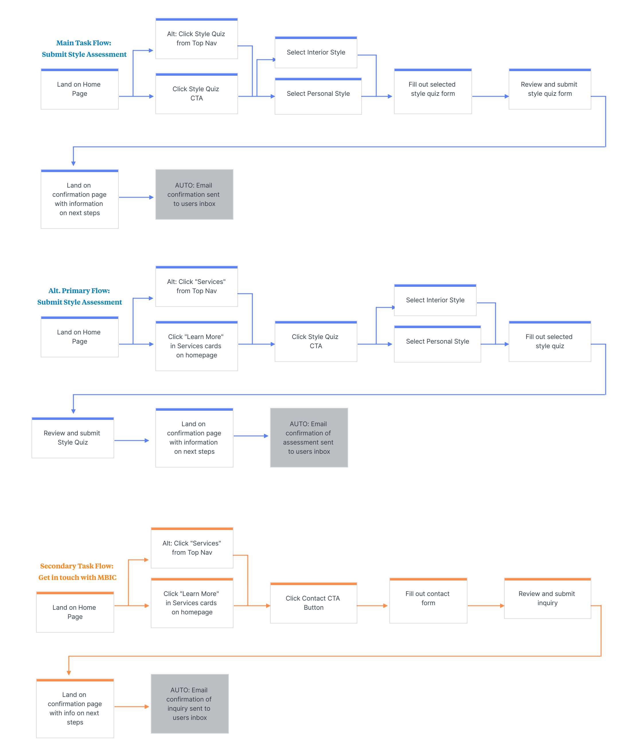
Setting up the
Primary Task Flow
The primary task flow we decided to focus on was the user filling out the style assessment in order to get started and start receiving their services.
III. Ideate:
What should it look like and how should users interact with it?
Design pattern research, sketches, and wireframes helped me determine how users will interact with the site to carry out tasks. Brand elements, which helped establish the look and lifestyle being presented to users, were also developed during this phase.
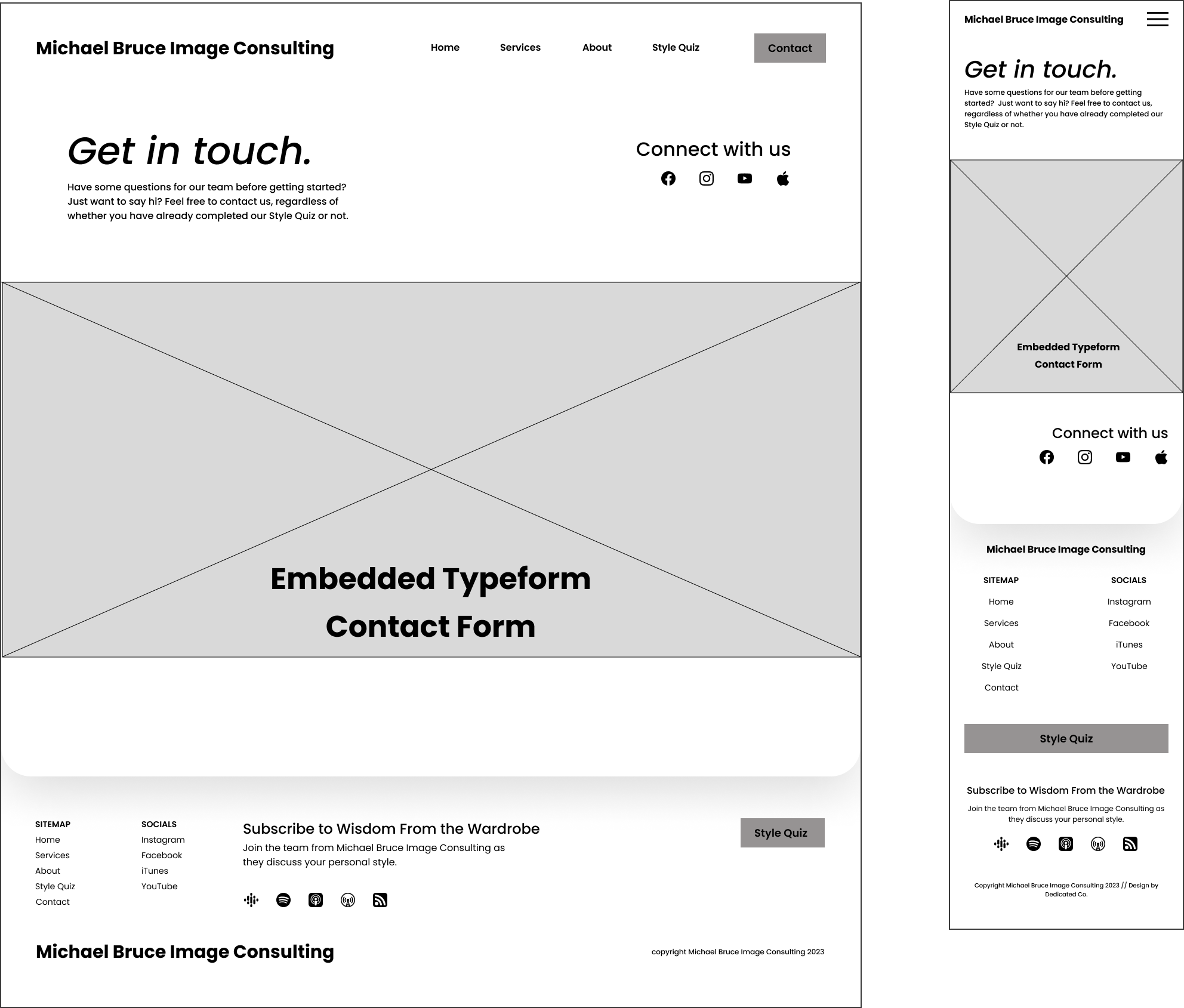
From Sketches to Wireframes
When working with clients, I like to do regular feedback check-ins during wireframe design and iteration. This helps ensures that the project and client goals remained aligned and on track. Additionally, involving the client in this process allows them to feel informed and empowered in the decision-making for the product they’ll have to operate once the project is complete.
Homepage

Services

About

Quiz Landing

Quiz Confirmation

Contact
Designing and Deciding Brand Elements
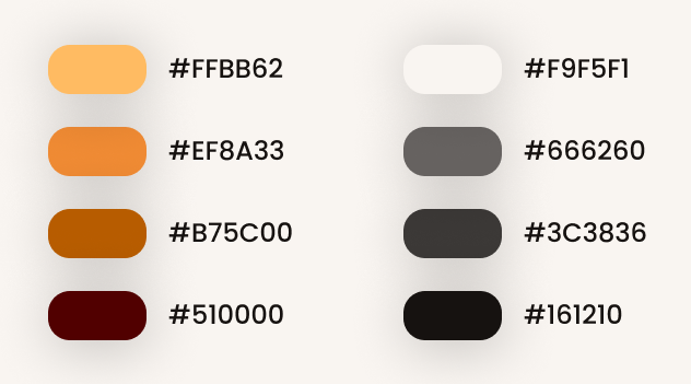
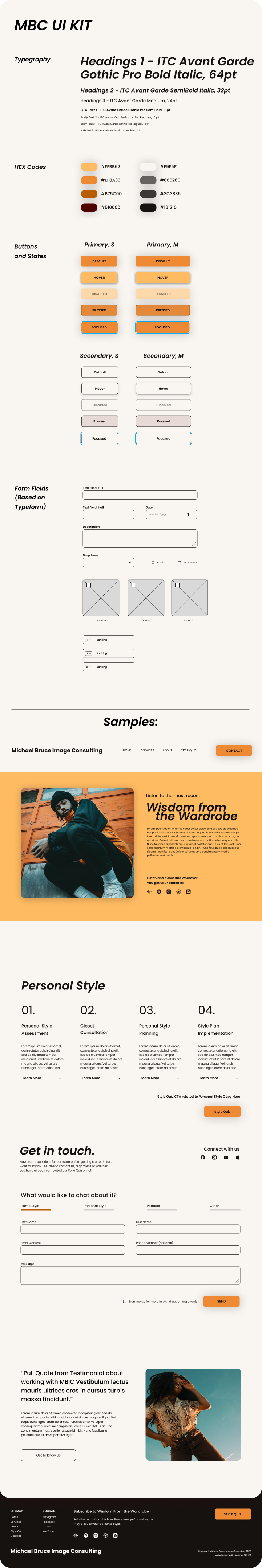
Brand Colors
MBC’s existing brand colors were orange and slate. Wanting to keep true their existing brand identity, I shaped the new palette around those colors, adding analogous shades to create more visual interest through depth and dimension.

Typography
ITC Avant Garde Gothic has a wide range of weights and styles that allow for flexibility between headers and body text.
The font’s history also helped cement the decision. Used in the Adidas and Avant Garde Magazine logos, it is inspired by the Bauhaus movement — a modern, evergreen style that is ubiquitous in both interior and fashion design. It straddles the retro and modern in a way that would feel approachable and clean for the average age demographic of MBC’s clientele.

Button States
I designed primary and secondary buttons to accommodate interactions for the primary and secondary user flows. We also designed different widths for mobile to reduce the risk of motor errors for mobile users.
Translating Wireframes to UI Screens

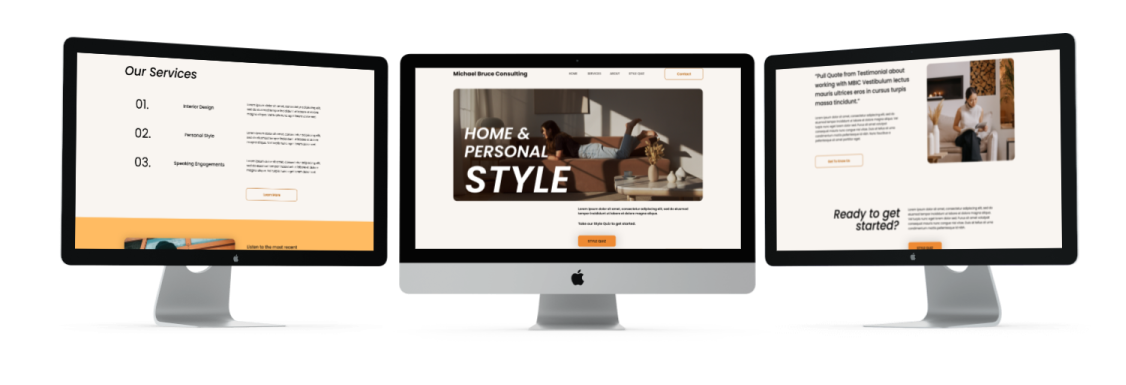
Homepage

Services

About

Contact

Quiz Landing

Quiz Confirmation
IV. Deliver:
Hand-off design files to the developer and prepare UI Kit for the client.
The site was designed for and built on Squarespace. While the developer built out the site, I worked on the Typeform quiz and prepared a comprehensive UI Kit for the client.


Proposed next steps to improve MBC.
Repository for past and future blog and media content.
Events calendar.
Press and press inquiries page.