

Wildfang Clothing Recycling Feature.
Project
Design an environmentally conscious feature for Wildfang’s 2022 Climate Neutral Initiative.
Timeline
March 2022
About Wildfang
Wildfang is an apparel company rethinking gender norms in fashion. Their key tenets are inclusivity, sustainability, and philanthropy. In 2022, they’re undergoing an audit of their company practices in an effort to become climate neutral.
I knew for this challenge I wanted to create a feature that benefited local communities and the environment. When I saw Wildfang’s new initiative during my preliminary research, I felt it was the right brand at the right time to explore this design challenge.
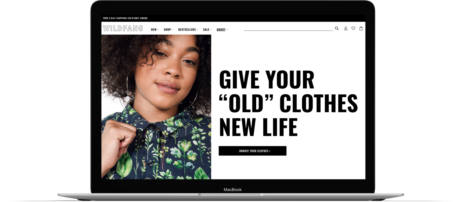


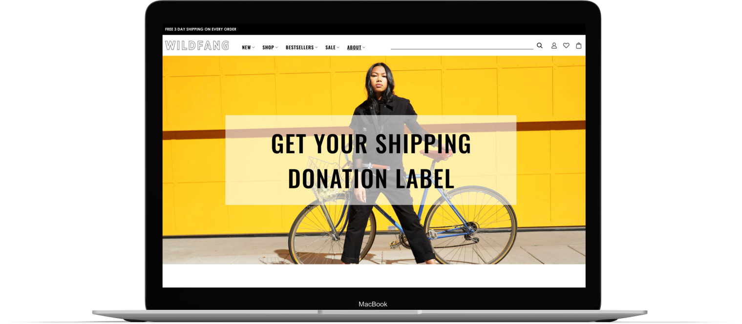


Table of Contents.
I. Empathize.
Hypothesis, Research Objectives, Research Findings
II. Define.
Persona, Feature Parameters, User Flow
III. Ideate.
Responsive Wireframes and UI Screens
IV. Prototype.
High Fidelity Prototype and Usability Test Planning
V. Test.
Usability Testing, Test Findings, and Next Steps
I. Empathize:
What was I aiming to understand?
My objective for this phase was to gain an understanding of what users’ clothing donation practices are and how other online retailers fit into those practices.

Hypothesis
A clothing donation and recycling program aligns well with Wildfang’s key tenets of philanthropy and sustainability. Providing an easy way for users to donate their old clothes via Wildfang in exchange for store perks would benefit the customer, the business, their charitable partners, and the environment.
I want to know…
how users are getting rid of their old clothes
So that I can…
design a feature that would make that process easy and rewarding.
Questions I explored through my research
What methods do users currently use to donate or recycle old clothes?
How often do users audit their wardrobes for clothing they no longer wear?
How are competitors approaching this type of service?
Are users aware that these types of services exist? If so, how was their experience using them?
Is knowing a company is environmentally conscious and philanthropic a motivating factor for users when deciding where to shop?
What Research Methodologies did I use?
Competitor research to see how other users have implemented similar features and practices.
User Surveys to collect data on what motivates users to donate their old or unwanted items.
Competitor Research
For direct competitors, I looked at online clothing retailers with donation/ recycling initiatives (Madewell and Pact).
For indirect competitors, I looked at online clothing donation/ recycling services, keeping. in mind that some could be potential collaborators (Give Back Box and ReTold).

-
Most retailers who offer this type of program have partnered with a service organization.
-
The most common perks offered to users who participate are store credit or discount codes.
-
Not many retailers include information about their donation/ recycling programs in the checkout process.
-
Having the option to print a shipping label on the site should be available too. It should be able to do this from feature’s “About” page.
Research Surveys
Service: The survey was created on Google Forms.
Participants: 15 individuals participated in the survey.
Screen: The request for participants was posted to my social and professional networks, inviting individuals who have donated their old or unwanted clothing to participate.
80%
Feel better about shopping at stores that are environmentally/socially responsible.
100%
that have used a retailer’s donation program found out about it at the checkout counter.
53.3%
Clear out old or unwanted clothes from their closets at least once a year.
60%
Go out of their way to seek out brands that are environmentally/ socially responsible
II. Define:
How should we solve the problem?
Design a feature for Wildfang’s Clothing Donation and Recycling Program that is enticing and simple to use.
Develop a User Persona
Based on my research and Wildfang’s target audience, I created a user persona to help guide decisions on the feature’s parameters and how they would be assembled in the user flow.
Feature Parameters:
What does the feature need in order for it properly function within the existing site? What can I add to make the product more enjoyable? The priority items were validated by the business, market, and user goals. Whereas, bonus features were validated by one or two of the findings. The Bonus Features are to be developed once the priority items have been tested and shipped.
Priority Items:
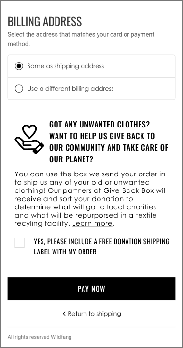
About Page: About the program and partner org, info on how donations are handled, info on how to participate, info on perks for participating, etc.
Checkout option: Add option to request a donation shipping lable with your purchase.
Donation label form: Where users can print the donation shipping label if they aren't placing an order first or forgot to opt in at checkout during their last purchase.
Bonus Items:
Account page: a place in the account page where users can look at past donations.
Store location page: Users can input their zipcode and find their nearest participating locations to drop off donations in-person.
Event pages: A list of upcoming clothing donation drives.
Setting up the User Flow
This user flow is for a user who sees an ad or promo for the program online. The first decision point is whether they'll shop before donating or go straight to donating. The flows go all the way through the donation's delivery and a confirmation email with the user's discount code.
III. Ideate:
What should it look like and how should users interact with it?
How should the feature look and how can I make sure it integrates well with the site’s existing design?
From paper sketches to responsive wireframes.
I created digital wireframes for all the screens required to test the main flow. From them, I tested that I was able to complete the primary task flow with a low-fidelity prototype. I also used this deliverable to work up some potential copy for the feature.
About Page: Hero Section


About Page: Overview and Process Breakdown

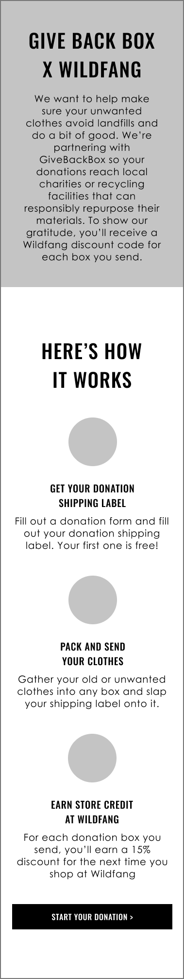
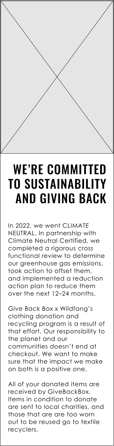
About Page: Goals and Transparency

About Page: FAQ Accordion


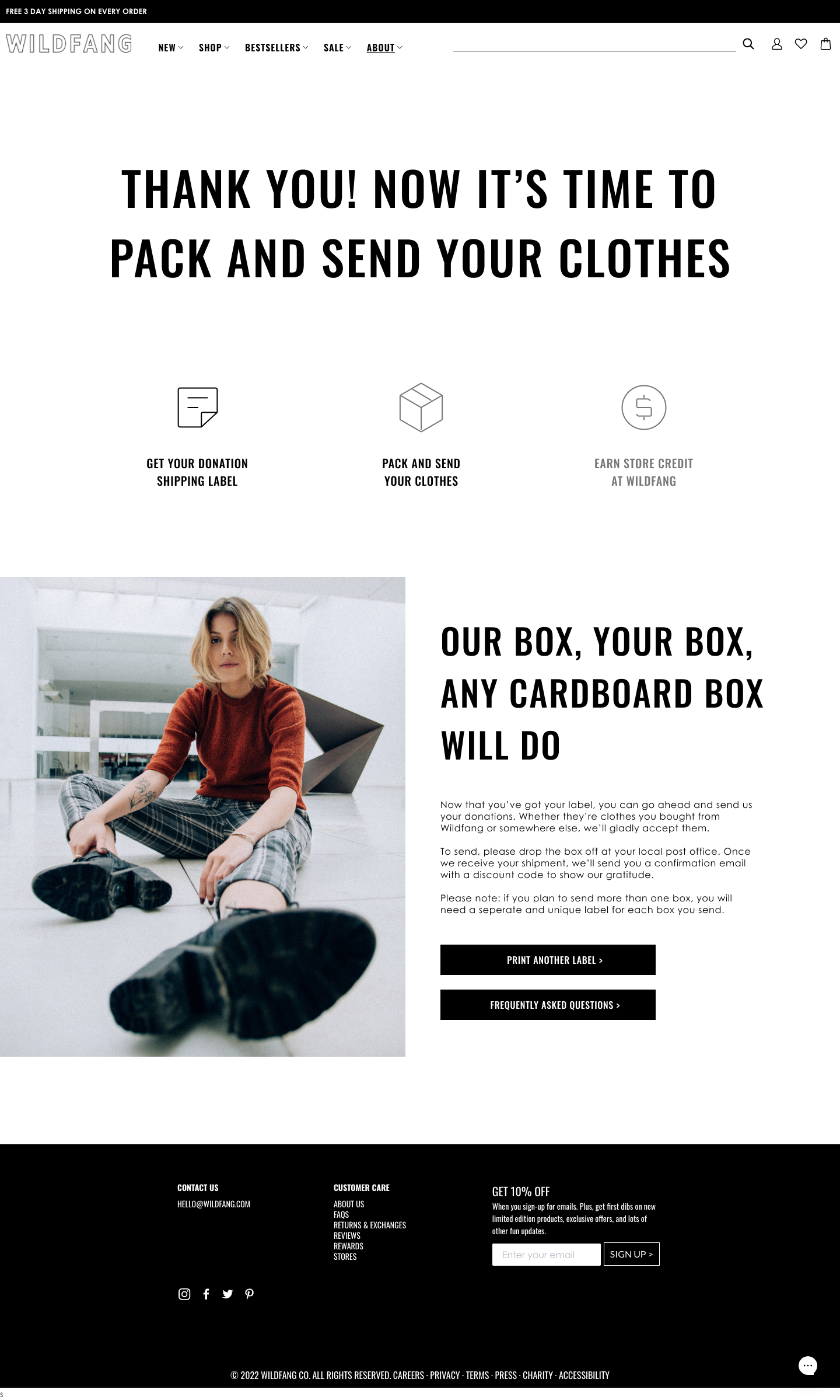
Shipping Lablel Process: Getting Started


Shipping Label Process: User Details Form
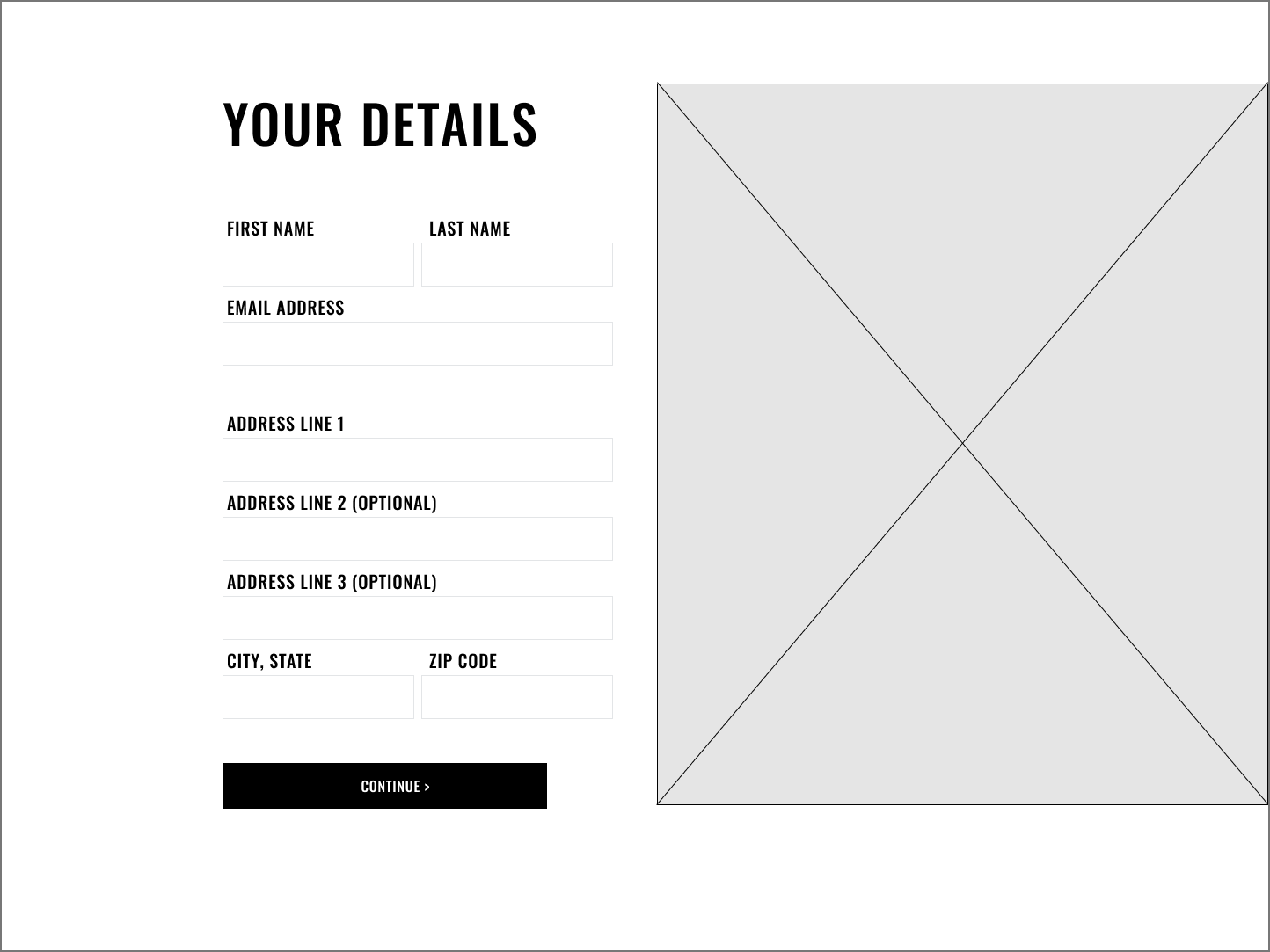

Shipping Label Process: Review Shipping Details


Shipping Label Process: Confirmation
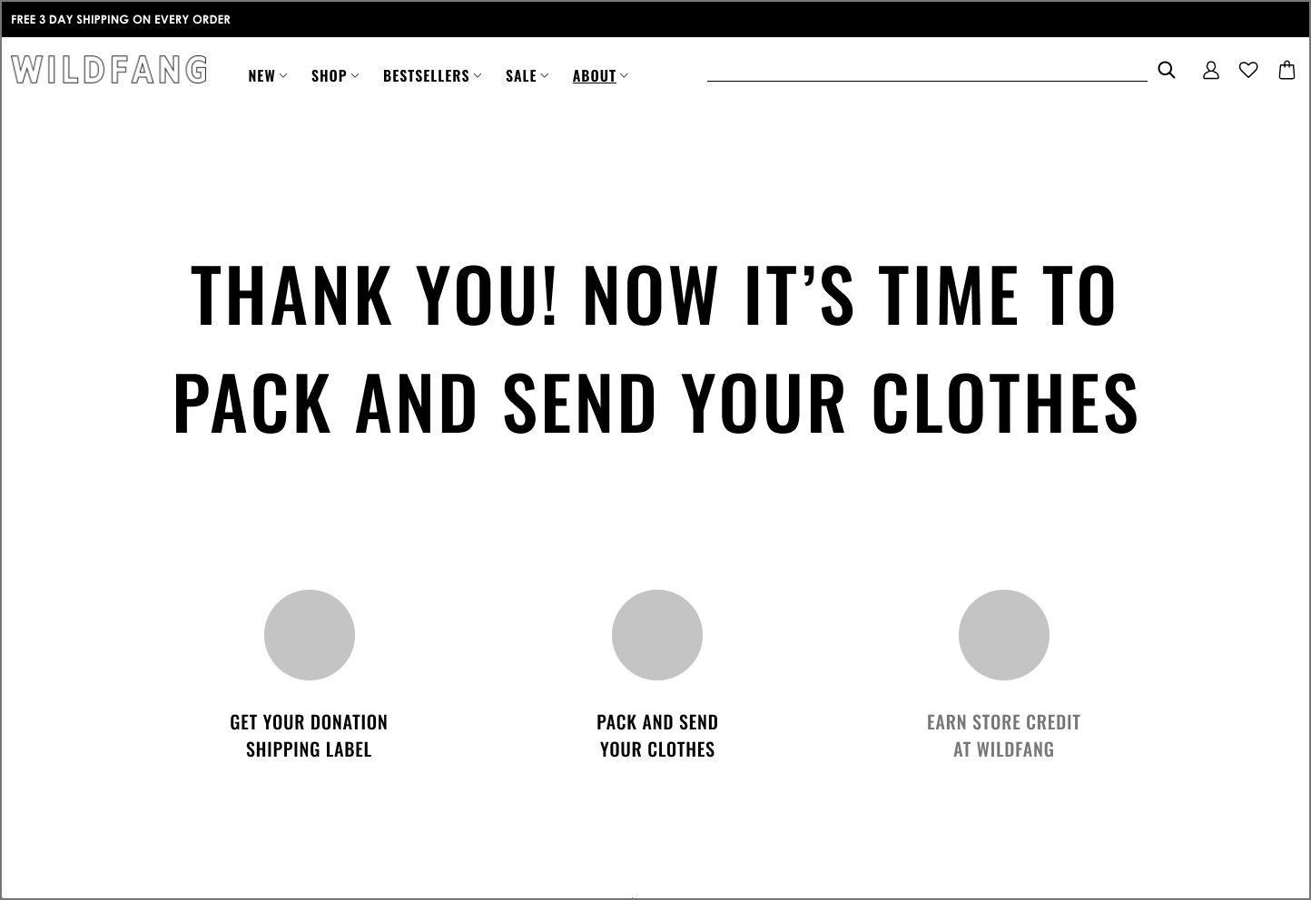

Shipping Label Process: Next Steps


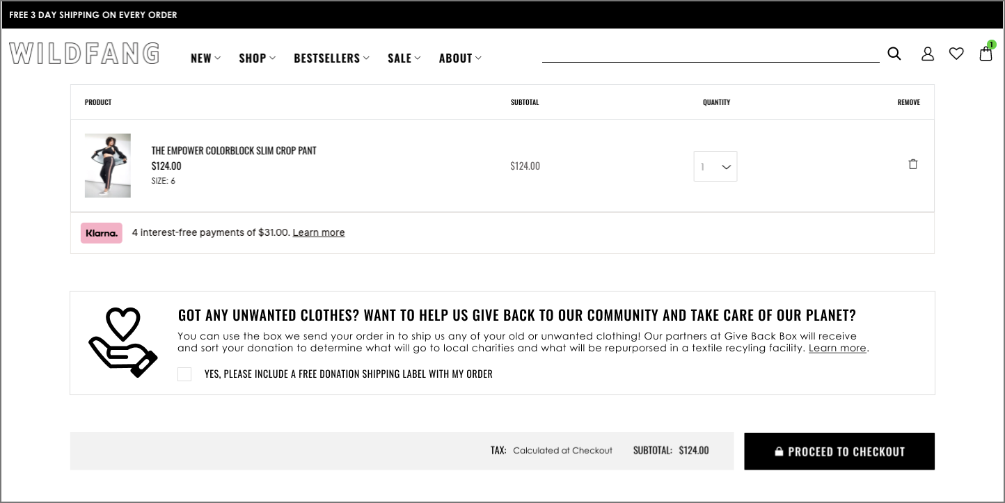
Purchase Opt-in Option 1: Shopping Cart
Purchase Opt-in Option 2: Checkout

Designing the feature’s UI Screens
With the page layouts and flow decided, my goal with the screens was to design something that fit the existing style of the site, but presented text in a way that is easy to parse through and digest for the user.
The navigation bar, footer, homepage, shopping bag, and checkout were screenshot from the company website and edited to include the components related to the donation feature.

About Page

Shipping Label Page

Confirmation Page
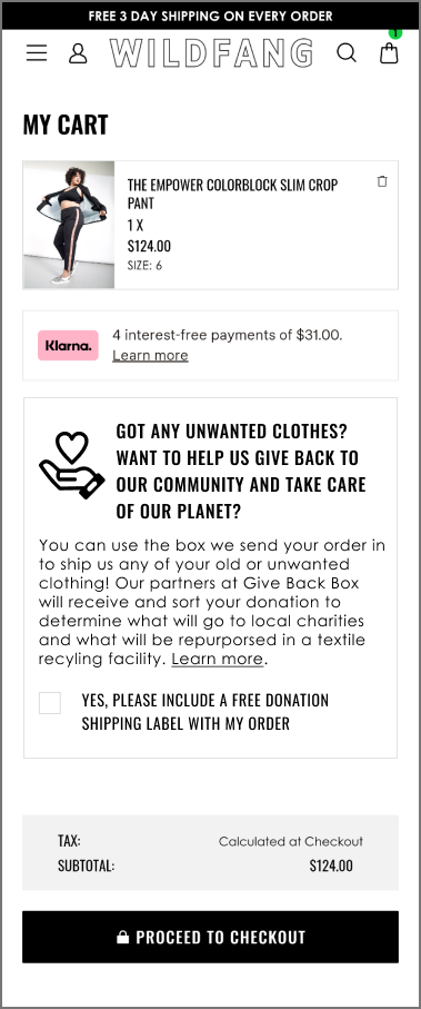
UI Screens for Mobile


IV. Prototype:
How can I test the new feature?
In this phase, I used my UI screens to build out a testable prototype that allowed users to explore the main flow.
Prototype
The prototype I put together explores two tasks in the user flow: Getting a shipping label from the website or Including a shipping label with your purchase from the store.
Usability Testing questions to keep in mind while designing the UI Screens and Prototype
Can users figure out how to participate in the program without going through the checkout process?
Can users easily find the option to participate in the program during checkout?
During the checkout flow, at what point are users more likely to click to opt into the program?
Will users find the information clear and simple enough that they are not deterred from participating?
V. Test:
Does the feature work and how can it be improved?
In my usability testing, I tested to see if users could complete the flows, of course. But also, if the way it’s set up is simple enough that it would encourage users to continue using the service.

Usability Testing Overview
The test was designed to determine whether users can: Get a label without going through the checkout process (home page > print label) and have a label included in shipment with an order (checkout option).
Test Subject
Prototype for Wildfang’s Clothing Donation and Recycling Program Feature.
Test Methodology
Remote testing: uploaded Figma prototype to Maze.co. I sent the link to individuals who elected to participate in testing during their research interviews, as well as my social and professional networks.
Test Pre-Screen
People who have or may want to donate their old or unwanted clothing.
Results:
Usability Testing Affinity Map
Priority Fixes:
✓
Include Guidelines with Printout
Because most users barely read the information on the about page, including instructions and guidelines on the printout with the shipping label will be important to avoid expensive and time-consuming errors.
✓
Add Banner to Homepage
Nested under “About” in the main nav is not the first place users would think to look. Adding a banner to the homepage will help users find the donation information quickly. Having a banner on the homepage is also a good way to promote it for users who haven’t heard about it the feature yet.
✓
Eye-catching Checkbox
One user mentioned their eyes would usually skip over a checkbox option at checkout, as they’re likely to assume it’s an option to sign up for a newsletter.

Potential Next Steps
Donation History in Account Page: a place in the account page users can go to participate and look at past donations, keep track of perks earned, etc.
Store Location Page: users can input their zip codes and find their nearest participating locations to drop off in-store.
Upcoming Events: A list of upcoming clothing donation drives, which can be scheduled around holidays like women’s history month, Pride month, etc. for example.
